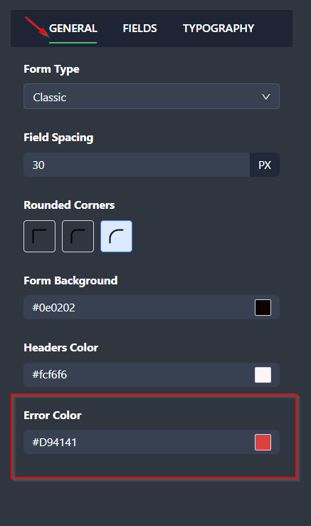
The error color in your form is a crucial visual cue that alerts users when something needs their attention, such as a required field left blank. By customizing the error color, you can ensure that errors are clearly visible while aligning with your form’s overall design.
Why Error Color Matters
- Improves Clarity: A distinct error color ensures users can easily identify and resolve issues.
- Enhances User Experience: Clear error messaging reduces frustration and helps users complete the form smoothly.
- Supports Branding: While red is the traditional choice for errors, you can choose a color that complements your design.
How to Change the Error Color in Clickiny
- Open your form in the Form Builder.
- Click the Appearance tab.
- In the panel on the right-hand side, go to the GENERAL tab.
- Locate the Error Color option and select a color from the palette or input a custom color code.

Tips for Choosing the Right Error Color
- Red: The standard choice for errors, as it immediately signals attention.
- Orange or Dark Pink: Provides a softer alternative while maintaining visibility.
- High Contrast: Ensure the error color stands out clearly against your background and other form elements.
Customizing your error color can make your form look more polished while helping users quickly address issues. Choose a color that’s both functional and visually consistent with your design!
Was this article helpful?